
Brand Identity | Corporate guidelines | Print Design | Signage
Holkham
Brand evolution, not revolution. A demand for a united visual expression.
With a stunning location on the north Norfolk coast and at the heart of a thriving 25,000 acre estate, Holkham is described as an exceptional place, rich in history, architecture and wildlife. The seat of the Earls of Leicester, the elegant 18th century mansion is still very much a lived-in family home which they take pride in sharing with visitors.

Where the sky meets the sea
The marketing team at Holkam Hall and Estate knew they where due a better way of communicating their identity, aware that their existing logo and dated system of brand guidelines lacked power and purpose.


Their communications where designed on a project-by-project basis often resulting in a variety of styles that blurred the boundaries of their brand identity.
Working meticulously with the Holkham Hall leadership team, a new identity developed.

The aim of the project was not to forge a wholly new identity but to fashion clarity and logic in how the existing elements should be used, refining the brand, and in the process, creating a logo that matched with their progressive, modern, ethos.
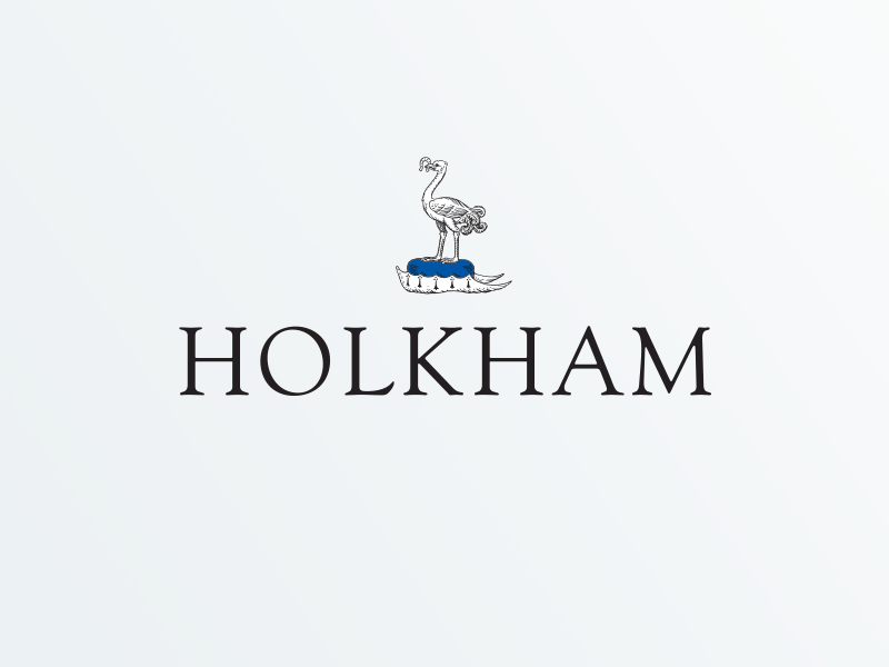
Allied with elements from the Earl of Leicester’s Coat of Arms, the typeface, Goudy has been a large visual part of Holkham Hall’s logo and brand identity, closely associating itself with the estates offering over recent decades. Departing from the complicated heraldic symbol of the previous design we could distill the new logo down to its purest, more memorable and graphic form, while retaining the font element from the previous long lasting design.
The logo’s font went on to be reworked in a new bolder, simpler wordmark, embracing the timeless Goudy typeface that had been so closely linked with the Estate, asserting ‘Holkham’ as a go to tourist destination.

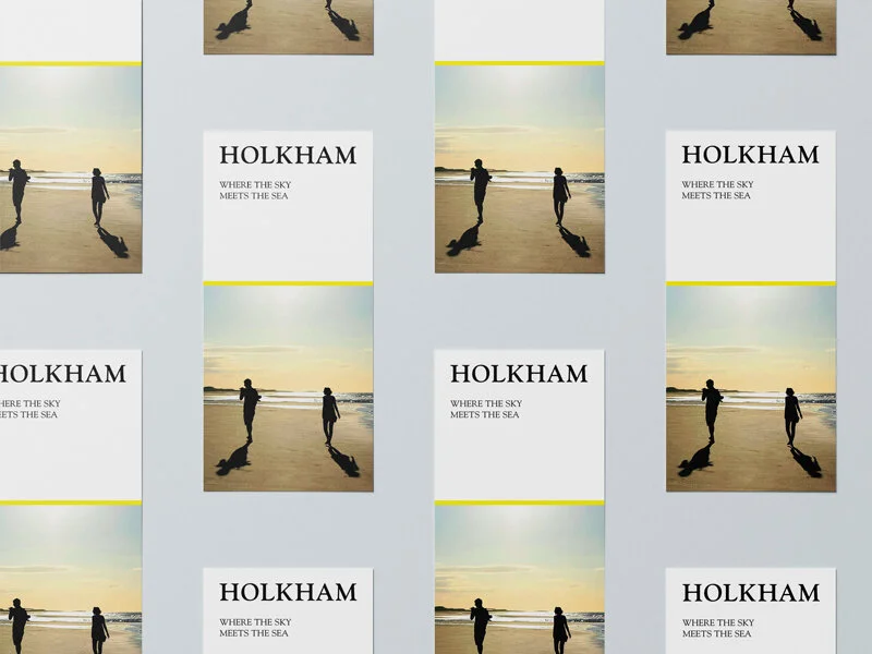
As part of the project a set of simple guidelines and digital template examples where crafted using photography, illustration and typography for their in-house team, enabling them to deliver a consistent brand across all communication materials, online and on paper.


Initial projects to use the new brand identity were their annual visitor attraction leaflet


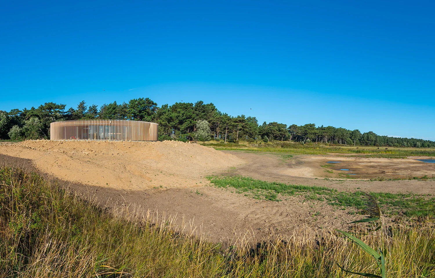
And their exciting new orientation centre, The Lookout, which included unique signage design, construction and print collateral.


Accredited: Shorthose Russell Ltd